LOOKING TO THE SHIRTS FOR WORLD CUP MEANING
The design of each team shirt could be one of the most fruitful perspectives in this World Cup. It’s a perspective that doesn’t involve corruption and as you’ll see in some cases, even tries to fight it.
All-in Global is the #1 language service provider for companies in the iGaming, sports and sports betting sectors. Our diversity in the workplace is one of the most important factors in our success. We offer equal opportunities regardless of gender, ethnicity, race, age, family status, disability, and religious or political beliefs.
And speaking of different ethnicities, races and religions, you’ll find few better examples of such diversity than the World Cup. But who has the best shirts? It’s over to our Product Designer Marina Ribeiro to tell us what she makes of it all. In her own words…
A DESIGNER’S DELIGHT
When All-in Global challenged me to give my opinion about this year’s World Cup shirts design, I happily accepted. As a product designer, I have an additional perspective of all the work and effort that is made behind the scenes before a product is shown to the public.
The World Cup, a global spectacle followed almost as passionately in sportsbook casinos as in stadiums, with its billions of viewers worldwide, might be one of the fashion designers’ most desirable opportunities to exhibit their work and talent.
FACTORS TO CONSIDER
Designers need to consider a lot more factors than simply the aesthetics of the clothes that players are wearing on the field. They also need to consider factors such as:
– The climate and conditions of the host country which requires testing different fabrics’ performances to make sure they’ll stand tough in such conditions.
– Specific requests from the football federations and FIFA regulations.
– Work with national colour palettes in a creative way to create a balance between the country’s identity and the best-possible aesthetics.
– Create concepts that involve a message (political or otherwise).
– The responsibility of creating a design that has the potential to become an iconic piece of football history, inspire young generations and emotionally move a whole country with a sense of pride. On the other hand, when things go wrong, they can accidentally create designs that end up dividing fans.
FORMER ESPORTS CLOTHES DESIGNER
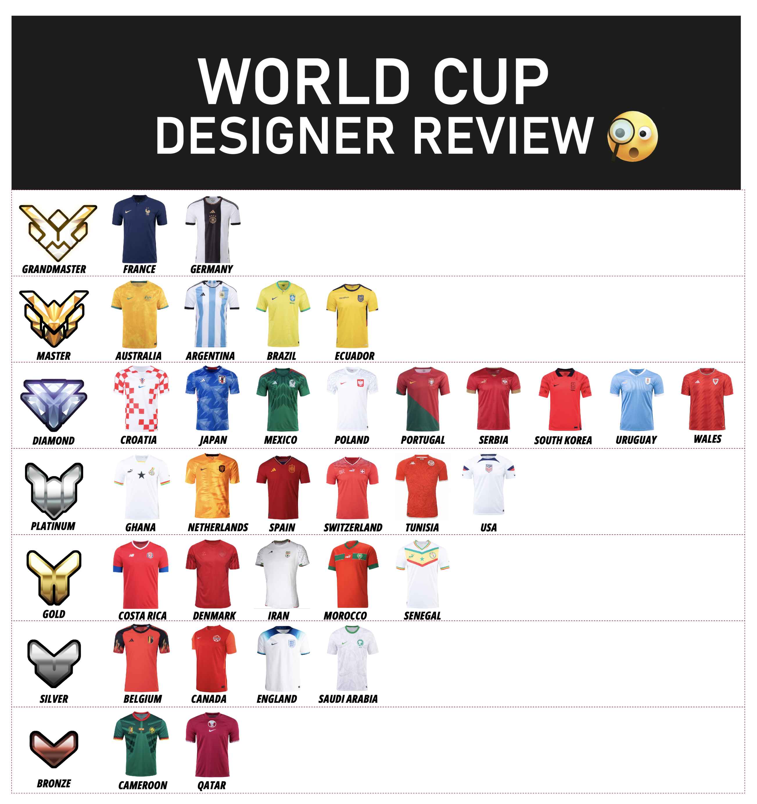
As an esports enthusiast and a former designer of esports clothing, I decided to rank the design of the Home jerseys of all the 32 teams competing in the World Cup 2022 using the rank system of my favourite game – Overwatch. This system creates a ranking system in seven different tiers, going all the way from bronze up to Grandmaster.
I created a chart to help me choose the best position on the rankings for each design. Here’s the final result.
Below you can find my review in alphabetical order along with some interesting facts about the design choices of each country.
If you need help with translation or content writing All-in Global works with more than 80 languages and is widely consider the number 1 language service provider in the iGaming industry.
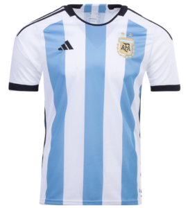
Argentina
Rank: Master
Design review: We see the classic three baby blue stripes in the white background contrasted with the black Adidas stripes. Adidas did a beautiful job combining so many stripes in a balanced way and adding some texture to the shirt elevated the whole design to a new level. On the back of the shirt, under the collar, you can see the national emblem of Argentina – Sol de Mayo – in a beautiful gold embroidery. Overall, it’s a stylish shirt that all Football fans would like to get their hands on and it comes with a very positive sustainable surprise – it’s made with 50 percent ocean plastic from Parley of the Oceans. Beautiful and sustainable, what else do you need?
Australia
Rank: Master
Design review: This shirt earns a high position on the chart because it beautifully incorporates the sense of identity of the country. With its yellow goldish stunning colour, it’s a shirt that almost teleports you to the sunny and sandy landscapes of Australia. The smooth texture completed with the contrast of the green in a yellow background makes this shirt one of my favourites. The Commonwealth symbol along with an emu and kangaroo makes this shirt a desirable item for any Australian fan, or supporter of the team. It’s almost like an Australian souvenir.
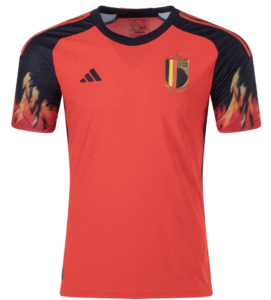
Belgium
Rank: Silver
Design Review: I’m sorry Belgium, but the Red Devil’s design for 2022 was not your best shot. In my opinion, the chosen colours are doing a good job of bringing out the reference to the devil’s identity but everything else is making this shirt look cheap. Usually, the textures elevate a shirt’s design but in this case the texture it’s not flattering. And what is there to say about the flames on the sleeves? It really reminds me of those flame stickers used to decorate tuning cars in the 90s. I consider this a good concept, but poorly executed. I guess if their fierce attitude is not well represented on this equipment, they will have to prove it on the field. So far they haven’t!
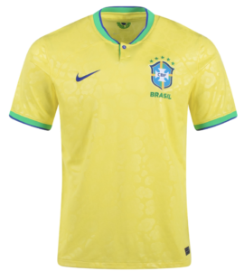
Brazil
Rank: Master
Design Review: This year Brazil is wearing a brighter yellow that is officially named “dynamic yellow”. There are rumours that the colours chosen for World Cup 2022 can be a tribute to the winning shirt of the World Cup in 2002. The pallet combination of yellow, blue and green is well balanced and the jaguar pattern is certainly giving out the winning team vibes.
In Portuguese (from Brazil) the English word jaguar translates as “Onça-pintada” and it’s well-known for being the biggest feline of the Americas, because of its muscular and robust body structure.
I don’t know about you but to me it seems like they are sending a message here.
I also love the retro collar detail, including a button which is not very usual in football shirts, giving it one extra point for innovation.
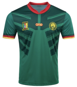
Cameroon
Rank: Bronze
Design Review: I’m positioning this shirt in the lowest rank, not because of the colour palette which is not great anyway, but because the three logos on the chest are not centred. The shirt is poorly executed when it comes to details. The materials not being the best can be due to understandable budget reasons, but not centering the logos on a shirt is just bad design. I give it a positive point for the nice detail on the shape of the collar but, I’m sorry Cameroon fans, I have to disapprove of this design.
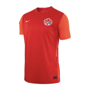
Canada
Rank: Silver
Design Review: Canada team is wearing the same equipment they have been wearing in the past year which automatically makes it less exciting. It has a nice vibrant red and I like the texture on the sleeves but overall it’s just a very plain design. If I needed to redesign this shirt I would probably use the maple leaf in a much more dynamic way or even use their motto “Mari Usque ad mare” which is officially translated as “From sea to see” as an inspiration for something innovative like using blue or waves in some details.
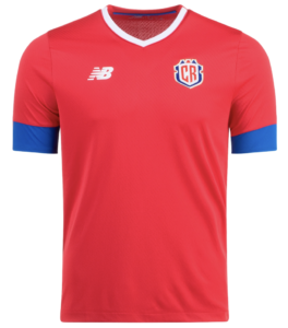
Costa Rica
Rank: Gold
Design Review: Good combination of colours between a vibrant red and an almost electric blue finished with some white details on the collar and sleeves. It’s a good design but something is clearly missing and it doesn’t get me too excited. Positive points are awarded for using a new symbol which incorporates a reference to the volcanoes and their national shield. It’s a nice effort to create a strong visual identity that represents Costa Rica’s national identity.
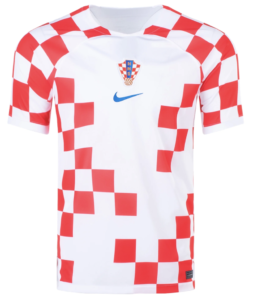
Croatia
Rank: Diamond
Design Review: I confess that I’m not generally a super fan of the traditional red and white checkers of Croatia’s design, but this time Nike did a nice job. By using an irregular pattern, they bring a modern vibe and a refreshed energy. The blue chosen for the Nike logo and country symbol makes the red squares shine and anticipates the passion that the players will demonstrate on the field.
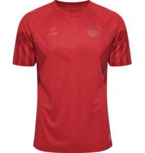
Denmark
Rank: Gold
Design Review: If I was going to consider only the visual of the shirt, I would rank it in a silver position because the design is very plain, monochromatic and almost non-existent. But the design is representing very well the message that they were trying to portray: they didn’t want visibility in a tournament that is hosted by a country with a very bad record on human rights issues. I appreciate their protest and for that I give them the gold stamp rather than the silver one.
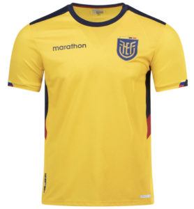
Ecuador
Rank: Master
Design Review: The Ecuador shirt is one of those cases where the details make all the difference. Although it’s not designed by any of the “big brands”, if you look closely, you will see that they did a great job. First, the use of a vibrant yellow is very representative of their national flag. The second great detail is the cut of the collar, which is very unique and gives a futuristic vibe. The subtle geometric pattern is very well applied and the colour details are amazingly well done. Inside the collar there is a logo that represents four Ecuador regions: Pacific Coast, Galápogos Islands, Andes mountains and the Amazon jungle. As if these are not enough details, they also included a graphic representation of Ecuador with the coordinates 0° 0′ 0″. And the cherry on top is that they printed on the back hem of each shirt the name of the country in six different languages. A great example of a shirt full of meaning, well worthy of the world’s biggest football competition.
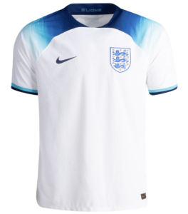
England
Rank: Silver
Design Review: This shirt was inspired by the Euro 1996 design which, in my opinion, was slightly better than the new design. The blue navy gradient effect on the sleeves is simply not working. The blue choice was a failed attempt to innovate from the traditional red details and was apparently supposed to represent the youth and energetic spirit of the England team. In my opinion, this concept ended up being one of the weakest shirt designs of England’s national team of the last few decades.
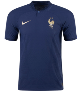
France
Rank: Grandmaster
Design Review: This is my favourite shirt of this year’s tournament. The combination of midnight blue with metallic gold is giving me royal and power vibes. It’s the shirt that would make anyone look cool and stylish just by wearing it. It has a very subtle and solid design which makes it stunning and it really incorporates the design moto “less is more”.
Even with a very discreet design, the shirt still tells the story of its nation with very interesting details: in the collar and sleeve you can see graphics of oak leaves and olive branches were used to represent strength, solidarity and peace. A golden gallic rooster is also embroidered as a reference to the proud spirit of French people.
There’s also a geometric elegant pattern and a button on the collar making this shirt a “magnifique” piece of sport design.
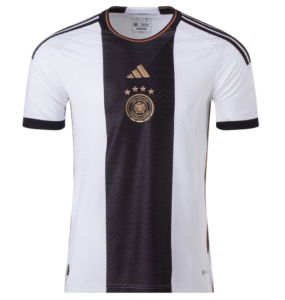
Germany
Rank: Grandmaster
Design Review: A shirt inspired by the first ever German national team is my second favourite this year. The centred gold logos in the black stripe on the front makes this Adidas design very unique. The choice of colours also gives me royal and rich vibes. I love the detail of using the flag colours in the collar and on the sides. The harmonious texture completes the best design worn by German players for many years. The words “die mannschaft” which translate as “The team” can be read on the inside neck. There’s a symbolism behind it since it’s the name of the German national soccer team and it portrays the trust of their fans on their team in terms of what they can achieve.
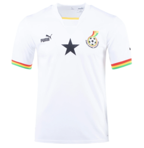
Ghana
Rank: Platinum
Design Review: It’s cool, nice and minimalist. Puma came up with an elegant design considering the colour palette and the black star popping in the centre is a nice touch. It has an old school vibe with a unique yellow detail on the collar. Ghanaians get to wear a sleek design with clean lines, which will certainly make them feel proud of their team and its history.
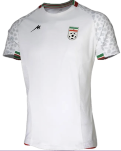
Iran
Rank: Gold
Design Review: This is another white shirt design that is simple and effective. There’s a reference to the Iranian cheetah in a detail appearing on the sleeves and which is less prominent on the side of the shirt. The Iran flag’s colour also appears in subtle stripes in the collar and in the interior part of the sleeves. While I appreciate that they kept the design simple, it doesn’t get me too excited. I give an extra positive point to Majid for the design because compared to the “big brands”, it did a better job than in some cases where Nike or Adidas were in charge of designing and making the shirt.
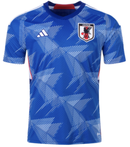
Japan
Rank: Diamond
Design Review: When you think of Japan you instantly think about white and a big red circle representing the sun. But in this year’s design, they will be wearing a nice shade of blue. To contrast the blue, they are using a three-legged crow pattern with origami vibes as a reference to their culture and self expression. In a personal interpretation, looking at the pattern, I can almost see the white peace dove, which is very relevant given the current state of the planet and constant threat of further war . I like how they balanced the blue with the traditional red of their flag, including stripes on the sides of the shirt. It’s a cool design but I’ll be happier when we see some anime reference on their national kits in the future. Fingers crossed.
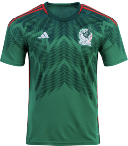
Mexico
Rank: Diamond
Design Review: Mexico is bringing a beautiful and vibrant green shade to the tournament and you can feel the ancient culture and the country heritage just by looking at the design. The inspiration of the geometric feathers pattern goes back to Aztec references, namely to Quetzacoatl. This is the name of a god that comes from the Nahuatl language and means “Precious serpent”; it was known for wearing feathers. In the Aztec culture, this creature was the god of air, sun and learning. This is a design that captures the spirit that the Mexican national team is bringing to the field and evokes a mythical spiritual strength.
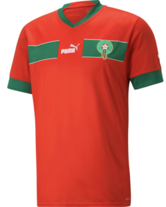
Morocco
Rank: Gold
Design Review: Morocco stayed very true to their national colours, meaning there’s not much going on in terms of design. I’m not very much a fan of how they cut the green horizontal stripe to include the Puma logo on the centre but I understand that is a reference to the Atlas Lions class of 1998. A positive point goes to them courtesy of the “Morocco” word written in Arabic at the back of their shirts, which contributes to the diversity that should be seen in global tournaments like the World Cup. I have to say that I’m a bit disappointed that Puma didn’t make use of the extraordinary art culture references from Morocco to create a much more sleek design. But there you go.
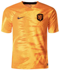
Netherlands
Rank: Platinum
Design Review: The Netherlands tried to innovate on the classic orange shirt that represents the famous Dutch “orange tradition”. Orange is the colour of the Dutch royal family and it’s been used as the national colour for many years. But this year they are using what they call a “Laser Orange” that’s more like a darker yellow. Despite the fact that the colour is not what fans would expect, there is symbolism behind it. The design is inspired by one of their national symbols – the lion. The design tries to simulate a mane of a lion in order to show their strength. The design is completed with a smooth texture that elevates the design. The black of the logos on the front with the Yellow (Laser Orange, they say) combination is a classic that always works well.
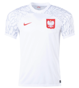
Poland
Rank: Diamond
Design Review: Poland’s national colours represent peace and honour so they already have a great message behind it. They kept the design clean and included sleeve graphics inspired by the nest and feathers of their national symbol – the Crowned white-tailed eagle. I especially like how their red shield symbol stands out on their chest, paying homage to Polish sovereignty and unity, which becomes more and more important these days.
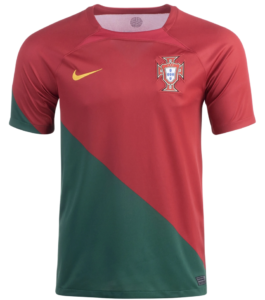
Portugal
Rank: Diamond
Design Review: As a proud Portuguese fan I could have ranked this design in a higher position; but I’m trying to make an honest review here! I believe the diamond position is more suitable in this case.
Portugal is proudly wearing their national colours with an interesting detail: the red shade used is called “peppery red” which can be a reference to the amazing Portuguese cuisine. They have a unique design with a diagonal angle which pretends to simulate the moments of victory where people wear their flags wrapped around their bodies in celebration. It’s a nice touch in terms of symbolism, but I’m not sure if aesthetically it was the best choice. Another detail worth mentioning is the “Armillary sphere” placed on the back of the shirt to represent Portuguese discoveries during the Age of Exploration. In fact, it’s also connected with the first sentence of the Portuguese national anthem that starts with “Heróis do mar” which translates as Heroes of the sea.
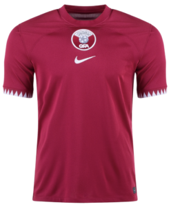
Qatar
Rank: Bronze
Design Review: As the host country of this year’s World Cup, you would expect a bit more work on their equipment design. The design is almost non-existent and the only detail we can find is the zig zag graphic on the sleeves that pretty much follows the visual of their national flag. The centred logos are not particularly impactful, which makes me conclude that its design only deserves the bronze ranking.
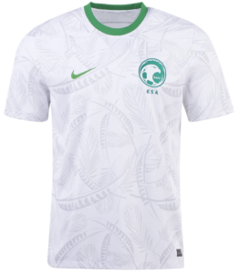
Saudi Arabia
Rank: Silver
Design Review: Saudi Arabia is using a white shirt covered in a palm tree pattern which represents the Kingdom’s assets. The design is completed with a light shade of green in the collar and in their logos. There’s not much going on, but I guess it does the job. We’ve seen worse.
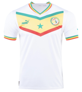
Senegal
Rank: Gold
Design Review: Senegal’s design takes a retro vibe and is paying tribute to their 2002 kit when they famously beat France in their opening match. They are using their national colours in the front with an arrow shape that ‘kinda’ reminds of super heroes clothes. On the right side they are wearing the Senegal coat of arms, which includes a lion who is interestingly very well accompanied by the Puma panther on the left. I guess the message here is that they will play with the intensity and bravery of these African felines.
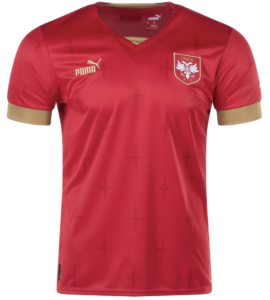
Serbia
Rank: Diamond
Design Review: Serbia offers us an elegant design combining a royal red with a jazzy gold. Adding to that, the use of the crosses in a smooth pattern certainly gives us majestic king vibes. Worth knowing that the Serbian cross is a symbol of the glorious times in the history of Serbian people when they ran the Serbian empire in medieval times. It’s nice to see this type of reference included in the design. Serbians will wear it proudly and try to prove the world that they deserved to be crowned champions themselves.
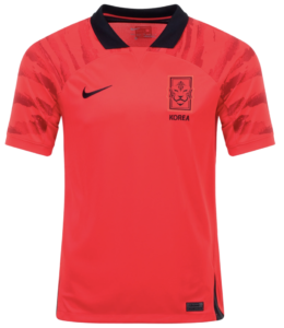
South Korea
Rank: Diamond
Design Review: Although this design doesn’t make it to the very top of the rank, it has a detail that earns a special medal for being rather clever. On the bottom sides of the shirt there’s a black triangle that comes together with the shorts, forming the shape of a devil’s tail. This detail is intended to pay homage to the official supporting group of the national South Korean team that is known as the “Red devils”. That’s a fantastic detail and I wish I’d thought of it myself! According to Nike, the design the inspiration is centered in are the Dokkaebi (Korean: 도깨비) which are legendary creatures from Korean folklore. These “Korean Goblins” are known to have extraordinary powers and abilities that the Korean boys certainly want to make use of. The design also includes a sleeve pattern that mimics tiger stripes, encapsulating once again a reference to Korean mythology. It is believed that when a tiger has been through many obstacles and starts to understand the meaning of life, his fur will become white and his spirit sacred.
Knowing all of that kinda makes me think that they should have a bit more white on their equipment, right?
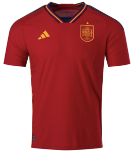
Spain
Rank: Platinum
Design Review: I think Spain’s design is very modest and I was expecting a few more references to their culture or at least a more original concept. It’s a minimalist and timeless design but no risks were taken, so it doesn’t get me too excited. Good choice of colours, but nothing very impactful, which makes me think that they are focusing on making the real impact felt on the field rather than off it.
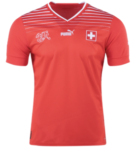
Switzerland
Rank: Platinum
Design Review: I’m pretty sure that I’ve eaten a Swiss chocolate wrapped in a design very similar to their shirt design for this year. So, when I look at the Swiss team I see chocolates. Is it good or is it bad? Jokes aside, I think they have a good design bringing a retro look to a new era. But… it’s missing some references to their country. It’s very plain and I believe they deserved a much more enthusiastic look.
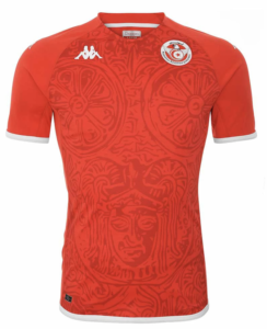
Tunisia
Rank: Platinum
Design Review: When I look at this design, my first thought is “Wakanda Forever” and I’m instantly taken to a world of ancient warriors. The inspiration is in fact related to battles since they pulled the pattern from the Ksour Essef cuirass, an ancient piece worn by the ancient Tunisian military that is linked with the great general, Hanibal. Although it’s a nice concept, I guess they could have made a less “in your face” design and still made the historic reference. It’s not a bad piece but it’s also not worthy of a top rank position.
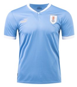
Uruguay
Rank: Diamond
Design Review: Across the 32 teams, I can’t think of a design that it’s more classic and old school than the Uruguay one. They are using the traditional celestial blue with white details on the collar and the sleeves. There’s not much contrast in the chosen colours and even the gold on the logos is not popping out. Apart from that, it’s undeniably an iconic shirt. Not because of a fantastic design but because of the historic references that are associated with Uruguay.
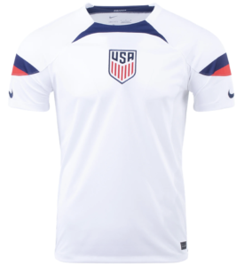
United States of America
Rank: Platinum
Design Review: In my opinion this design is a bit of a disappointment. They could have used so many references to make the design more interesting and more representative of their nation. The only detail worth mentioning is that they used the Nike logo on their sleeves instead of using it in the front as a reference to the way that it’s done in American Football. Other than that, I believe that this design is missing some authenticity.
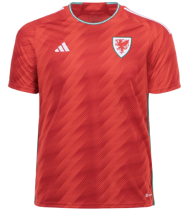
Wales
Rank: Diamond
Design Review: A beautiful vibrant red that takes inspiration from the famous red Welsh dragon (Ddraig Goch in welsh). The zig-zag texture elevates the design of this shirt from a design that could be considered plain, to a stylish and cool piece. The green and white shades from the flag are used in the right spots to bring a bit of contrast. On the back of the shirt you can see a flower -a daffodil – with the Wales motto, ‘Gorau Chwarae Cyd Chwarae’ (‘Team play is the best play’) which embodies the spirit that the Welsh team is bringing to the field.